Thursday, December 08, 2005

Final Entry!

Well this is it. FINALLY! My last journal entry. It's required that I include a self critique. There are so many things that didn't go my way this semester, but I am finally finished and while I'm not totally and completely satisfied with the "Ellen" project it's time to put it down. The one thing I really wish I'd done was identified the type issues at the beginning, or been assertive enough to insist that my project not be labeled a title sequence.


This is my final sequence where the audience sees Ellen splintered before having the splintered versions of herself. This was basically a Matte scene like George Melies's "Man on the Moon" This wasn't the easiest sequence since it required stabilization to keep all of the frames from sliding around. I hano idea how Melies did it. Anyway this is Butch signing off.

Tale of the Text


I have to vent a little bit here before go into my description just because I've noticed that some of my collegues that have their journals published online have had fun being totally honest and less matter of fact about describing they're day to day progress. I never intended for my project to be categorized at all except as a compositing project that fleshes out the opening of an indpendent film and uses all of the new compositing for film and video techniques that I've learned while at CADA. Unfortunately, for me, I feel like I've been shoehorned into the category of having to make this a "Title Sequence" project and have been constrained quite bit by that category and it's been frustrating to work that way on a project that I conceptually designed as something else. I don't dislike the process and I know that the staff is trying to look out for my best interest, but I really wish there was a compromise for how my project was percieved through this process.

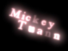
Anywhoo...I did really enjoy how these came out and the whole process of how they developed into the final font style and animation. Not much changed and a lot changed from my original conceptualization if that makes any sense at all. The fact that I built the text in Maya to take advantage of a lot of unique benefits that suited this particular he way the titles enter and exit stayed the same, the way I shaded the text stayed the same the that changed and really caused total havoc starting at the midpoint of the semester for me was the script font that I really liked that creating kerning issues that I didn't view as problematic, for this project, because I wanted use imbalance as a metaphor in every visual element possible to convey the the confused state of mind the character is in. Ultimately, I do think rekerning helped, but it just put me so far behind from when the kerning issues were first identified, about three weeks ago that it's been impossible to stay on time dealing with all of the additional problems that arose from that plus the progress of problem solving for the other parts of the project.

Ok, I unintentionally starting ranting again. Here's how the progress went from the top image to the bottom. 1.) I had created the color scheme and built the shaders for my text around that and I knew exactly how I wanted to animate them; in by hand and out by through dynamics which gave enough order and then chaos to accurately be a metaphor for a confused state of mind. I wasn't comfortable with the text font and wasn't sure where to go with it, when Benita suggested that the text should be more delicate it made a lot of sense and after atleast three different font revisions for the entire animation of each title I settled on a script font, which was good and horrible at the same time. The dynamics animation was what I placed the highest precedent on and getting that to work correctly with the scripted text has turned out to be the job from Hell. Probably with about four weeks left there was just a back forth correction and recorrection of the same things that I think really put me behind late in the semester. Because I placed the animation higher on my list of prioritiesI felt like the cascade of dynamics problems that occurred as a result of changing the position of the letters was destroying animation that was important to the visual storytelling and that I worked extremely hard to get. I was and still am somewhat aggrivated by that because I'd intended for the letters to be unbalanced from the beginning through the use of diiferent shaders and letter positioning. Was I right? Was I wrong? I don't know I just know that it was what I wanted for my project.
Tracking troubles


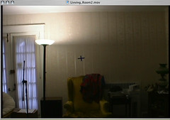
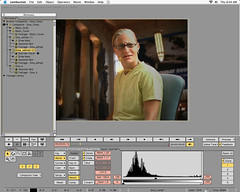
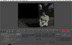
This had to be tracking attempt number 16 or 17 in combustion where I re-shot the zoom-in with a different marker in hopes that I would be able to retrieve just the tracking data and reapply it original footage, but that didn't work. In the end the area between the bright light, lightpole and the wall and the upper right corner of the high back wing chair were the area Shake used to track.

Shake Tracker


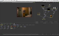
I must have attempted to track this painting frame to the wall for the zoom in no less than twenty times in combustion without success using every possible technique of tracker placement technique known to mankind. While I won't say that the discreet tracker is no good it didn't work for me in the instance. I essentially had to re-composite this whole scene from the ground up in Shake just get back to the point of trying to track the frame to wall. To my great surprise and relief Shakes tracker tracked the frame perfectly after only two attempts.

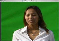
Actual Green Screen


This was actually composited into the frame the was on the living room wall and the entire pre-composited frame with video was tracked to the wall above the high back chair for a zoom in that I did with my camera. This is really the transitional scene where the audience goes from listening in on a conversation Ellen is having to actually going inside of her head.

Last Minute Addition


This is an element that was critical just in terms of visually bridging a transition between the living room scene and the Frames scene. I initially cut because it was difficult to keep the audio sync'd and felt like it wasn't necessary and at the time I thought it added too much clutter, but I'm attempting to put it back in, because it does seem to help the transition develop more smoothly.

Another Lost Frame


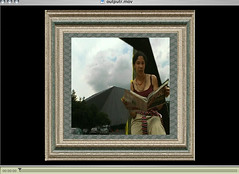
This is another frame that wouldn't fit into the timeline after I locked down the timing of the edit and the transitions. It turned out to be a good thing though, because the only take that turned out well was one where a big steam cloud flew right in front of the actress.

Another Frame


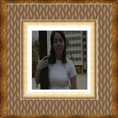
This is another frame that "rains" down pretty quickly.

Note: Now that I'm thinking back using the frames and reducing the size of the composited video was something that figured in largely to me making the decision about the "Cascade of Frames." I knew I would have budgetary constraints and wouldn't be able to afford high resolution film or HD which can be magnified pretty large before starting to show degradation, but being able to reduce the size of the low resolution video started to level the playing field, in addition to being a concept that worked well with my story.

Wednesday, December 07, 2005

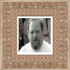
Jeremy Frame

I have to say I really felt good about the quality of these frames and how well I was able to mix the seperate elements for a story that I wanted to tell; it has just been a satisfying feeling.

Monday, December 05, 2005

More Keying + Roto


This is another frameset that won't see much time, but there was a lot of work involved in keying and then rotoscoping around the face and mouth area because of some keying problems which are unfortunately pretty standard.

hit counters
OfficeMax Coupons