Wednesday, November 09, 2005

The Process


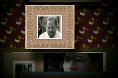
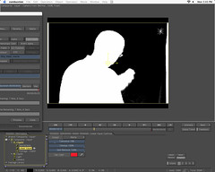
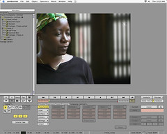
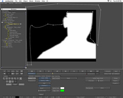
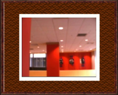
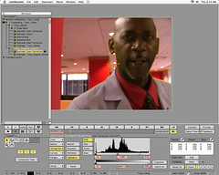
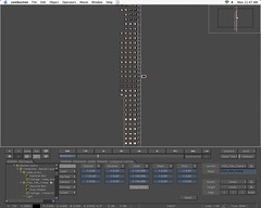
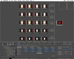
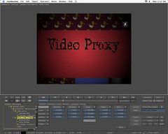
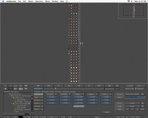
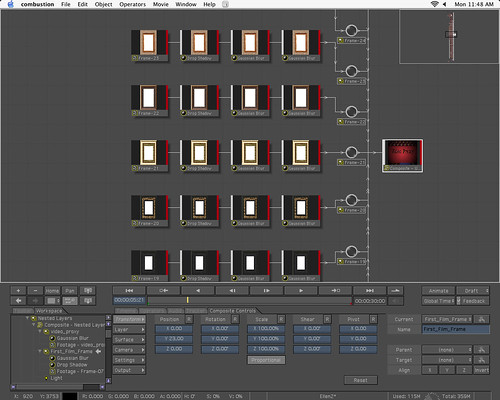
For me the entire process, for putting together the "Cascade of Frames" scene entailed getting the actors (Friends, family and a few actors/aspiring actors)Giving them general idea of what the story was I wanted to convey, writing gudelines that I had for their particular charcter, but allowing them to improvise from that foundation and directing them "On set." This was one of the most enjoyable parts of the project for me in that it allowed me to work with actors, which is something I haven't really done since film school. The technical workflow entailed scouting the right exterior locations for the foreground and background and shooting both. More and more often visual effects professionals are being asked to become involved earlier and earlier in the production schedule, because no matter how good the software is for manpulating the pixels on screen knowledge of the limits of the tools plus exceptional filmmaking sensibilities allows great post-production effects professionals to come up with the best solutions possible that ultimately get the director the shots they want, save the producers money and save countless hours, days or even weeks of post-production man hours. The next phase was re-digitizing the footage and then "comping" all of the elements together by keying out backgrounds, color correcting and or color matching within the compositing tools. In this case the tools I used were Discreet combustion Apple Shake and my trusty Canon XL-1 Dv camera. The main differences you'll notice with these images is that I didn't shoot all of my Chroma Key shots with "Green Screens" and I didn't shoot them in interior studio light. Just based on personal experience I knew that I would be able to get a clean key from the bright red backround, if I shot it outside, because better quality and intensity of light. I've always had the experience that interior studio light yeilds almost sterile images that are always more difficult to successfully composite with other types of footage. Typically, the rule of thumb with Chroma Keying is that you do not use colors that will match skin tone at all, however given that I was shooting on video which is always less saturated in color than film I needed the extra red "spill" to enhance the color quality of the footage. I also planned to shoot all of my backgrounds at twilight or "Magic Hour" which are inherently more gold/red in terms of light color the non-green chroma key backgrounds. I also made sure my subjects were far enough in front the scrims that there wouldn't be too much spill.


More Keying + Roto stuff


More of the same stuff. I really liked the lighting and was able to get a decent, but not perfect key. Unfortuantely this won't make it into the project, but I learned a lot from working on it.

Keying and Roto


Me setting up my garbage matte for pulling the key


Just the background color adjusted.

Chroma Keying + Rotoscoping

Key_Roto_Tests


In this image I wasn’t able to pull a clean key for everything, most problem areas were in the head and face area, and I did some rotoscoping in the center of the face but decided to not do full out hair pulling, tedious rotoscope work for the whole image because of how small and possibly covered it would be in the composition of the whole sequence as well as time considerations. I also expanded my white and grey tone in all of the images to simulate the look of film, which doesn’t have black or white levels nearly as high as video. I put it in the composition like this and felt like mistake weren’t noticeable and so I left it in.. I’m glad I did because I went to extra special care in setting up the color composition of the foreground and background at the production/creative phase, if I had a junior compositor( he,he), it would have gotten completely rotoscoped.

Workflow problems and solution


This was my first attempt at setting up the composition having all of my blurs, keys and every other effect live in one composition, which worked fine for the proxy material, but basically overloaded and killed every render I attempted once I added video, keying actions, color correcting actions etc. My solution was something suggested by an instructor from one of my compositing courses: PRE-COMPING. Essentially, I set up all of my frames, with video, color adjustments, and effects in the scene, but rendered them all separately without animation, then re-imported them into a new scene that only had the background elements so the renderer only had to contend with those background elements, the animation of the frames, and the pre-processed video those frames contained.

Link to larger Image:
OverloadingNodes

Workflow setup


The node view in combustion, while not as useful as in Shake, flint or flame, gave a me a pretty clear view, visually of where my mistakes were and how to fix them based on where the node actions were applied.

Link to larger Image:
Node View

Into the world of Motion Graphics

Frames Construction Captures


This is more work on the frames sequence. This is the first proof of concept test where I transfer the technique building the composition from Photoshop and illustrator into a motion design environment. The transition was pretty smooth and I reused my high-resolution elements designed in Illustrator and Photoshop. The one hiccup I ran into was unexpectedly having to build my gradient patterns with alpha channels in Photoshop, because the look of the sparse color in the gradients changed to something that I didn’t think looked consistent with the way I’d designed it in Photoshop; the gradient almost looked like it had more of a bluish tint instead of a “Warm” brown tint.

"Raining Down Frames"

Frames Design Test


This was the first concept/style frame that I worked through using Photoshop and Illustrator mostly to flesh out a concept I had in my head, but also to just try figure out whether I could realistically fake three dimensionality and the texture of an “Old Rich Room” with all two dimensional elements in a compositing or image editing environment with a significant amount of control. I’d actually been looking at “Classic Frames” a Photoshop plugin for generating picture frames typically reserved for oil paintings from an archive of image and procedurally built source material. I had actually been thinking about using classic picture frames as design element for a couple of years, but thought I would be doing it in print. When I started developing the “Ellen” concept and wanted to visually define what was going on in the character’s head stylistically, for me the ‘Raining Frames” was a perfect fit.

hit counters
OfficeMax Coupons