Thursday, December 08, 2005

Final Entry!

Well this is it. FINALLY! My last journal entry. It's required that I include a self critique. There are so many things that didn't go my way this semester, but I am finally finished and while I'm not totally and completely satisfied with the "Ellen" project it's time to put it down. The one thing I really wish I'd done was identified the type issues at the beginning, or been assertive enough to insist that my project not be labeled a title sequence.


This is my final sequence where the audience sees Ellen splintered before having the splintered versions of herself. This was basically a Matte scene like George Melies's "Man on the Moon" This wasn't the easiest sequence since it required stabilization to keep all of the frames from sliding around. I hano idea how Melies did it. Anyway this is Butch signing off.

Tale of the Text


I have to vent a little bit here before go into my description just because I've noticed that some of my collegues that have their journals published online have had fun being totally honest and less matter of fact about describing they're day to day progress. I never intended for my project to be categorized at all except as a compositing project that fleshes out the opening of an indpendent film and uses all of the new compositing for film and video techniques that I've learned while at CADA. Unfortunately, for me, I feel like I've been shoehorned into the category of having to make this a "Title Sequence" project and have been constrained quite bit by that category and it's been frustrating to work that way on a project that I conceptually designed as something else. I don't dislike the process and I know that the staff is trying to look out for my best interest, but I really wish there was a compromise for how my project was percieved through this process.

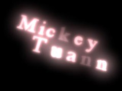
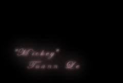
Anywhoo...I did really enjoy how these came out and the whole process of how they developed into the final font style and animation. Not much changed and a lot changed from my original conceptualization if that makes any sense at all. The fact that I built the text in Maya to take advantage of a lot of unique benefits that suited this particular he way the titles enter and exit stayed the same, the way I shaded the text stayed the same the that changed and really caused total havoc starting at the midpoint of the semester for me was the script font that I really liked that creating kerning issues that I didn't view as problematic, for this project, because I wanted use imbalance as a metaphor in every visual element possible to convey the the confused state of mind the character is in. Ultimately, I do think rekerning helped, but it just put me so far behind from when the kerning issues were first identified, about three weeks ago that it's been impossible to stay on time dealing with all of the additional problems that arose from that plus the progress of problem solving for the other parts of the project.

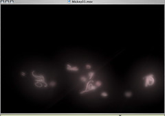
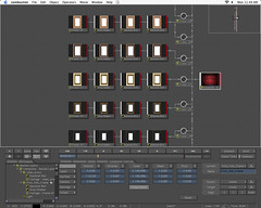
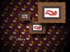
Ok, I unintentionally starting ranting again. Here's how the progress went from the top image to the bottom. 1.) I had created the color scheme and built the shaders for my text around that and I knew exactly how I wanted to animate them; in by hand and out by through dynamics which gave enough order and then chaos to accurately be a metaphor for a confused state of mind. I wasn't comfortable with the text font and wasn't sure where to go with it, when Benita suggested that the text should be more delicate it made a lot of sense and after atleast three different font revisions for the entire animation of each title I settled on a script font, which was good and horrible at the same time. The dynamics animation was what I placed the highest precedent on and getting that to work correctly with the scripted text has turned out to be the job from Hell. Probably with about four weeks left there was just a back forth correction and recorrection of the same things that I think really put me behind late in the semester. Because I placed the animation higher on my list of prioritiesI felt like the cascade of dynamics problems that occurred as a result of changing the position of the letters was destroying animation that was important to the visual storytelling and that I worked extremely hard to get. I was and still am somewhat aggrivated by that because I'd intended for the letters to be unbalanced from the beginning through the use of diiferent shaders and letter positioning. Was I right? Was I wrong? I don't know I just know that it was what I wanted for my project.

Tracking troubles


This had to be tracking attempt number 16 or 17 in combustion where I re-shot the zoom-in with a different marker in hopes that I would be able to retrieve just the tracking data and reapply it original footage, but that didn't work. In the end the area between the bright light, lightpole and the wall and the upper right corner of the high back wing chair were the area Shake used to track.

Shake Tracker


I must have attempted to track this painting frame to the wall for the zoom in no less than twenty times in combustion without success using every possible technique of tracker placement technique known to mankind. While I won't say that the discreet tracker is no good it didn't work for me in the instance. I essentially had to re-composite this whole scene from the ground up in Shake just get back to the point of trying to track the frame to wall. To my great surprise and relief Shakes tracker tracked the frame perfectly after only two attempts.

Actual Green Screen


This was actually composited into the frame the was on the living room wall and the entire pre-composited frame with video was tracked to the wall above the high back chair for a zoom in that I did with my camera. This is really the transitional scene where the audience goes from listening in on a conversation Ellen is having to actually going inside of her head.

Last Minute Addition


This is an element that was critical just in terms of visually bridging a transition between the living room scene and the Frames scene. I initially cut because it was difficult to keep the audio sync'd and felt like it wasn't necessary and at the time I thought it added too much clutter, but I'm attempting to put it back in, because it does seem to help the transition develop more smoothly.

Another Lost Frame


This is another frame that wouldn't fit into the timeline after I locked down the timing of the edit and the transitions. It turned out to be a good thing though, because the only take that turned out well was one where a big steam cloud flew right in front of the actress.

Another Frame


This is another frame that "rains" down pretty quickly.

Note: Now that I'm thinking back using the frames and reducing the size of the composited video was something that figured in largely to me making the decision about the "Cascade of Frames." I knew I would have budgetary constraints and wouldn't be able to afford high resolution film or HD which can be magnified pretty large before starting to show degradation, but being able to reduce the size of the low resolution video started to level the playing field, in addition to being a concept that worked well with my story.

Wednesday, December 07, 2005

Jeremy Frame

I have to say I really felt good about the quality of these frames and how well I was able to mix the seperate elements for a story that I wanted to tell; it has just been a satisfying feeling.

Monday, December 05, 2005

More Keying + Roto


This is another frameset that won't see much time, but there was a lot of work involved in keying and then rotoscoping around the face and mouth area because of some keying problems which are unfortunately pretty standard.

Wednesday, November 09, 2005

The Process


For me the entire process, for putting together the "Cascade of Frames" scene entailed getting the actors (Friends, family and a few actors/aspiring actors)Giving them general idea of what the story was I wanted to convey, writing gudelines that I had for their particular charcter, but allowing them to improvise from that foundation and directing them "On set." This was one of the most enjoyable parts of the project for me in that it allowed me to work with actors, which is something I haven't really done since film school. The technical workflow entailed scouting the right exterior locations for the foreground and background and shooting both. More and more often visual effects professionals are being asked to become involved earlier and earlier in the production schedule, because no matter how good the software is for manpulating the pixels on screen knowledge of the limits of the tools plus exceptional filmmaking sensibilities allows great post-production effects professionals to come up with the best solutions possible that ultimately get the director the shots they want, save the producers money and save countless hours, days or even weeks of post-production man hours. The next phase was re-digitizing the footage and then "comping" all of the elements together by keying out backgrounds, color correcting and or color matching within the compositing tools. In this case the tools I used were Discreet combustion Apple Shake and my trusty Canon XL-1 Dv camera. The main differences you'll notice with these images is that I didn't shoot all of my Chroma Key shots with "Green Screens" and I didn't shoot them in interior studio light. Just based on personal experience I knew that I would be able to get a clean key from the bright red backround, if I shot it outside, because better quality and intensity of light. I've always had the experience that interior studio light yeilds almost sterile images that are always more difficult to successfully composite with other types of footage. Typically, the rule of thumb with Chroma Keying is that you do not use colors that will match skin tone at all, however given that I was shooting on video which is always less saturated in color than film I needed the extra red "spill" to enhance the color quality of the footage. I also planned to shoot all of my backgrounds at twilight or "Magic Hour" which are inherently more gold/red in terms of light color the non-green chroma key backgrounds. I also made sure my subjects were far enough in front the scrims that there wouldn't be too much spill.


More Keying + Roto stuff


More of the same stuff. I really liked the lighting and was able to get a decent, but not perfect key. Unfortuantely this won't make it into the project, but I learned a lot from working on it.

Keying and Roto


Me setting up my garbage matte for pulling the key


Just the background color adjusted.

Chroma Keying + Rotoscoping

Key_Roto_Tests


In this image I wasn’t able to pull a clean key for everything, most problem areas were in the head and face area, and I did some rotoscoping in the center of the face but decided to not do full out hair pulling, tedious rotoscope work for the whole image because of how small and possibly covered it would be in the composition of the whole sequence as well as time considerations. I also expanded my white and grey tone in all of the images to simulate the look of film, which doesn’t have black or white levels nearly as high as video. I put it in the composition like this and felt like mistake weren’t noticeable and so I left it in.. I’m glad I did because I went to extra special care in setting up the color composition of the foreground and background at the production/creative phase, if I had a junior compositor( he,he), it would have gotten completely rotoscoped.

Workflow problems and solution


This was my first attempt at setting up the composition having all of my blurs, keys and every other effect live in one composition, which worked fine for the proxy material, but basically overloaded and killed every render I attempted once I added video, keying actions, color correcting actions etc. My solution was something suggested by an instructor from one of my compositing courses: PRE-COMPING. Essentially, I set up all of my frames, with video, color adjustments, and effects in the scene, but rendered them all separately without animation, then re-imported them into a new scene that only had the background elements so the renderer only had to contend with those background elements, the animation of the frames, and the pre-processed video those frames contained.

Link to larger Image:
OverloadingNodes

Workflow setup


The node view in combustion, while not as useful as in Shake, flint or flame, gave a me a pretty clear view, visually of where my mistakes were and how to fix them based on where the node actions were applied.

Link to larger Image:
Node View

Into the world of Motion Graphics

Frames Construction Captures


This is more work on the frames sequence. This is the first proof of concept test where I transfer the technique building the composition from Photoshop and illustrator into a motion design environment. The transition was pretty smooth and I reused my high-resolution elements designed in Illustrator and Photoshop. The one hiccup I ran into was unexpectedly having to build my gradient patterns with alpha channels in Photoshop, because the look of the sparse color in the gradients changed to something that I didn’t think looked consistent with the way I’d designed it in Photoshop; the gradient almost looked like it had more of a bluish tint instead of a “Warm” brown tint.

"Raining Down Frames"

Frames Design Test


This was the first concept/style frame that I worked through using Photoshop and Illustrator mostly to flesh out a concept I had in my head, but also to just try figure out whether I could realistically fake three dimensionality and the texture of an “Old Rich Room” with all two dimensional elements in a compositing or image editing environment with a significant amount of control. I’d actually been looking at “Classic Frames” a Photoshop plugin for generating picture frames typically reserved for oil paintings from an archive of image and procedurally built source material. I had actually been thinking about using classic picture frames as design element for a couple of years, but thought I would be doing it in print. When I started developing the “Ellen” concept and wanted to visually define what was going on in the character’s head stylistically, for me the ‘Raining Frames” was a perfect fit.

Sunday, October 16, 2005

First Posting


Well, it's time to dig up all of my materials for my "Ellen" film open project and post it to this new Blog. Above is an image sequence for a pretty work heavy, effects and design wise, project that I did during one semester for one out of four classes. The class was titled "Designing for Previsualization" and while it doesn't have to be taken the semester before thesis many times it is. I'd intended to do my thesis that following semester, but due to a lot of things that didn't happen. Essentially, the class allows you the oppurtunity to explore and build the basic structure of a large thesis like project; the ideas, the story elements, the techniques to be employed and most importantly how to pull them together. A lot of people that come to CADA tend to have general art or design backgrounds, or architecture backgrounds, or computer programming backgrounds, so this class is an absolute must for them because it deals pretty strictly with organizing design ideas into a linear and/or narrative fashion which is probably very different than how work is done in all of those different discplines. This is primarily a "Live Action" project versus a 3D one, but the workload is about the same if not a little more than my intended thesis project. This is an intro for another film I'd like to produce and direct at some point titled "Ellen." For this project I shot DV footage of twelve different actors against green screen backgrounds, shot seperate background plates, succesfully pulled clean keys for all of the footage, designed the titles and title animation,

hit counters
OfficeMax Coupons